Challenge With over seven years of growing success, Brawlhalla has built up a loyal community with their unique hand drawn art style, never-ending collaborations and exciting seasonal events. With this in mind, how can we refresh their brand identity, whilst still acknowledging potential future adaptations and speak directly to their fanbase?
Idea The Brawlhalla community is made up of both newcomers, and those that have been there from the start. But, they’re all united by one thing: brawling. More than just a gaming genre, brawling has become a way of life for Brawlhalla’s players. They don’t just fight to compete, but for pure, unadulterated fun!
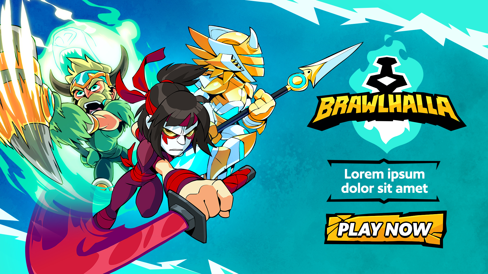
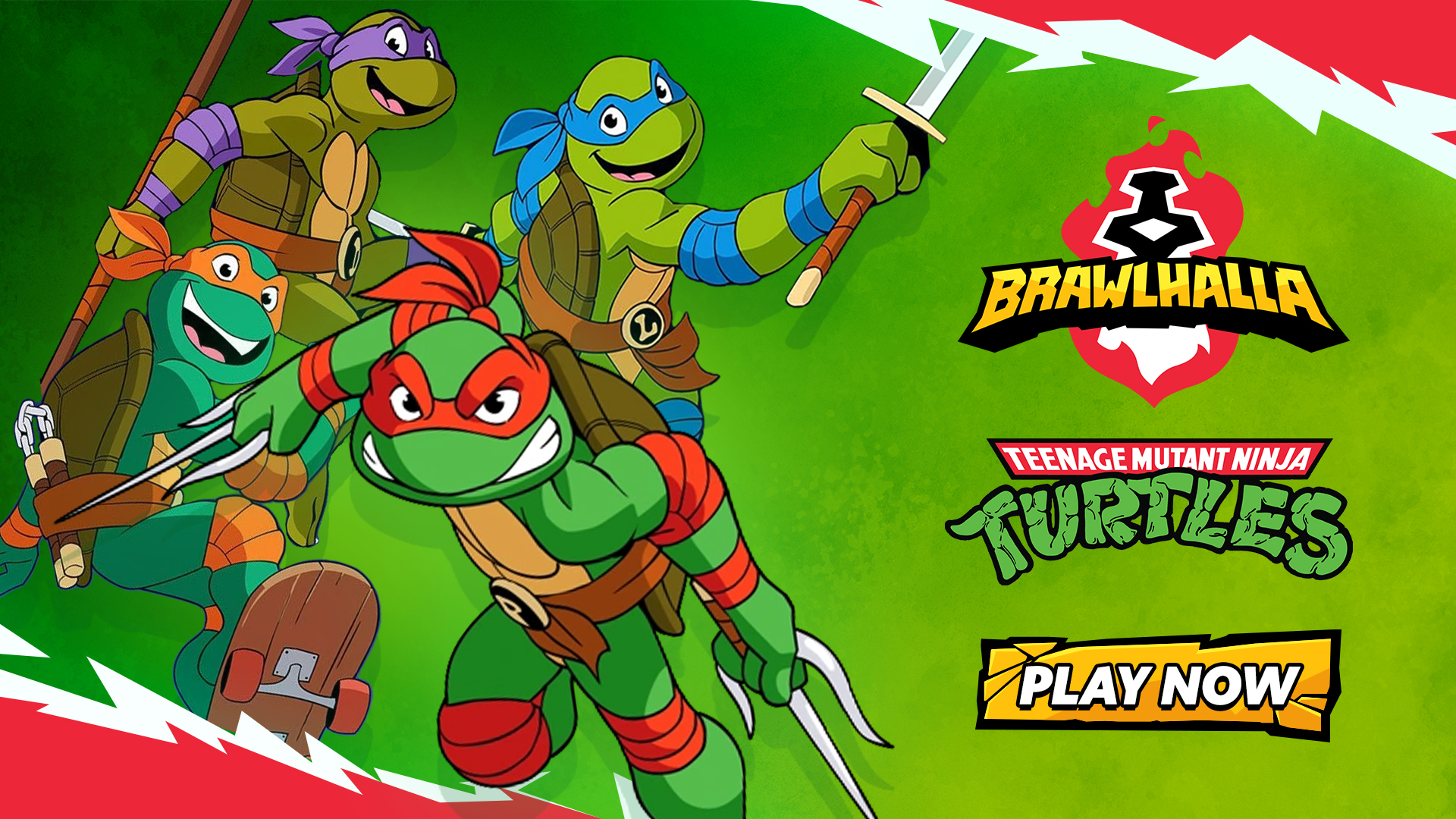
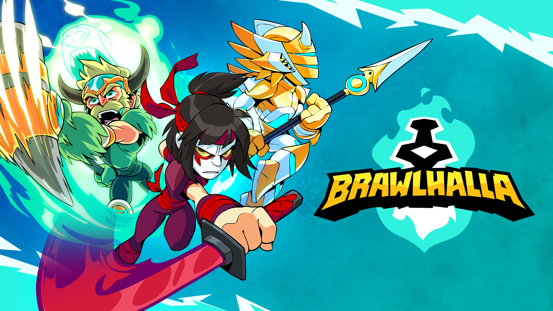
![]() Initially, we focused more on the lore, the competition, and the lighthearted energy present within the game while keeping key elements of the initial logo - the bold aspects within the name, and the Mjolnir. We wanted to show evolution, to show the community we’re looking ahead to the future whilst still respecting the past.
Initially, we focused more on the lore, the competition, and the lighthearted energy present within the game while keeping key elements of the initial logo - the bold aspects within the name, and the Mjolnir. We wanted to show evolution, to show the community we’re looking ahead to the future whilst still respecting the past.
From initial concepts, discussions with Ubisoft, from marketing to studio creatives, was essential in evolving the different iterations and finding the right balance overall for the logo and other brand assets. The work on the color scheme gave a vivid energy to both the logo, the art direction, and overall inspired the new game UI too!
Distinct shapes and textures were used to highlight the game’s beloved characters, and helped to drive a colorful, dynamic, hand drawn brand identity that invited the fans to compete and fight in a fun, lighthearted way. Logos, shapes, colors, and marketing assets were all compiled in a custom brandbook for Brawlhalla to refer to for the upcoming years of success ahead!
![]()