Context and challenges Ubisoft’s tactical first-person-shooter game, Tom’s Clancy Rainbow Six Siege, managed to recover from a middling launch to a success story. Ubisoft’s effective way of listening to its players and taking on the feedback for this game has helped it to be one of the fastest growing esport titles.
In 2020, Ubisoft announced plans to take Tom’s Clancy Rainbow Six Siege to the next esport level. While evolving towards a regionalised program with a consistent global frame, Ubisoft wanted to allow a stronger focus on local particularities.
Following this new positioning, Ubisoft EMEA turned to Biborg to lay down the ground for a regional creative coherency, answering to some discrepancies between local league identities so far.
The objective was to stay true to the game’s DNA and regional esports events logo structure, while providing territories with the possibility of creative freedom and the ability to customise it with their own local touch, such as flag colours, patterns, fonts and other elements. The aim was to ensure that when looking at the final national competition logo, we see that it is the same family but with a strong local personalisation.
Our answer As esports is growing, it’s becoming more and more difficult to stand out from the competitors in terms of creative identity. Our goal was then to avoid a “esports” typical look and feel, using often heavy shield shapes, banners and prominent typography.
We first came up with a premium global structure, based on simple but sleek and sharp lines. As for the local touch, Biborg undertook different creative iterations based on the Russian and Italian models to better understand the challenges that local leagues will have to overcome to personalise their own logos.
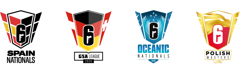
National sense of belonging, in a creative speaking way, can be expressed differently depending on the local culture. For some countries, it can be illustrated only with the colours of the flag, for others, it won’t be enough and they might need to add a stronger symbolic like pattern or symbol without falling in the cliché elements, as a symbol doesn’t always represent a whole country, for example, the Eiffel Tower is not France. As such, we came out with a structure with only two customisable slots: the center and the wings. While allowing the territories enough creativity to fit with their local culture expression (shapes, colours or patterns), the overall scope was delimited to not have custom elements outside these two spaces.
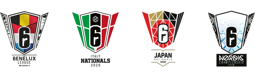
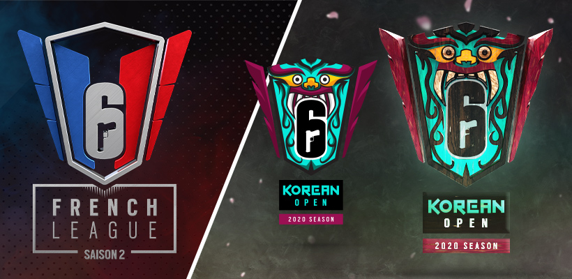
Biborg produced the main master which territories used as a base to create their own local adaptations, except for Ubisoft France and Korea who turned to us to create their adaptations. We undertook a thorough study of the local cultures & symbols to come up with different proposals and variations.
Through the Korean logo for instance, we wanted to integrate elements echoing in a creative and premium way - the Dokkaebi mythology, the traditional art colours, the Korean glyphs and the trigrams used in the Korean flag.